What’s the difference between a default Sharetribe design and a truly branded marketplace?
What can you change in Sharetribe without code?
When do you need a Sharetribe marketplace designer?
Sharetribe design case studies: from template to branded product
Do you need a full redesign for every Sharetribe customization?
Subscribe and you will promptly receive new published articles from the blog by mail
A default Sharetribe marketplace looks like a template – clean, functional, but generic. Turning it into a branded product requires moving through three layers of customization: no-code Console tweaks (logo, colors, fonts), code-level Extend customizations (UI components, layouts, user flows), and full-stack development (complex features, integrations). The smartest approach? Start with what you can do yourself, then bring in a Sharetribe marketplace designer or developer for the parts that actually differentiate your business. This article breaks down exactly what you can change without code, when to hire a Sharetribe designer, and what a real Sharetribe design transformation looks like.
- Sharetribe design is what separates a validated idea from a product people trust with real money – the underlying platform is the same either way.
- Start with no-code visual customization: logo, color scheme, and homepage content cover most of what a new marketplace needs in its first months.
- Design files unlock everything the Console can't – custom listing cards, fonts, icons – but they need a developer to implement safely.
- Hire a Sharetribe marketplace designer once you need a full brand system or UX rework, not just a color swap, and pair them with a developer from day one.
- A case-by-case rebrand, done well, changes how buyers and investors perceive the marketplace without touching its core functionality.
What’s the difference between a default Sharetribe design and a truly branded marketplace?
Spend an afternoon browsing Sharetribe sites, and you’ll start to recognize them the way you recognize a rental car: functional, familiar, and clearly not anyone’s in particular. Same grid of listing cards, same placeholder hero section, and same font pairing. A branded marketplace runs on the exact same platform underneath – same database, same checkout logic – but you’d never guess it, because the logo, color scheme, imagery, and copy all point back to one specific niche instead of “marketplace in general.”
Why the default theme is both a gift and a trap
That difference matters more than founders expect. Sharetribe deliberately ships every new marketplace with a clean, functional default theme so people can launch and test an idea in days rather than months. It’s a strength for validation. It becomes a liability the moment real users start comparing your Sharetribe website design to Airbnb, Etsy, or any other polished product they use daily.
How users (and investors) perceive template design
Buyers and sellers don’t consciously think “this runs on Sharetribe.” They just register the marketplace design as either trustworthy or generic. A rental platform for professional camera gear, a boutique fashion resale site, and a local services marketplace all launch from similar Sharetribe templates, but they should never look alike once real customers arrive.
There’s a quieter cost too, one that’s harder to put a number on. Anyone who’s sat through a few pitch meetings can spot an unmodified Sharetribe template in about two seconds – Sharetribe or otherwise, it’s the same instinct that flags an unmodified Bootstrap theme. It won’t torpedo a fundraising conversation by itself. But it plants a quiet question: has this founder put real thought into the product, or just launched the template as-is and stopped there?
Aspect | Default Sharetribe design | Branded marketplace design |
|---|---|---|
Logo & color scheme | Sharetribe placeholder logo, default blue palette | Custom logo, brand-specific color scheme applied across every screen |
Homepage | Generic hero banner, stock template copy | Custom hero, niche-specific imagery, tailored value proposition |
Listing pages | Standard grid layout shared with every other Sharetribe template | Layout, filters, and badges adapted to how the niche actually shops |
First impression | Reads as “built on a template” | Reads as a standalone, funded product |
Buyer trust | Lower – reads as generic or dated, even if visitors can’t say why | Higher – nothing about it looks interchangeable |
What can you change in Sharetribe without code?
More than most founders assume. Sharetribe’s Console gives non-developers direct, no-code visual customization over the elements that shape first impressions: logo, color scheme, homepage layout, and marketing copy – all editable without touching a design file or a line of CSS.
How do you customize color scheme and logo settings?
Under Console > Branding, you customize the logo, favicon, and the full color scheme – primary color, button color, link color – in a few clicks, with no design file involved. Changing the color scheme alone, away from Sharetribe’s default blue, does more to break the “default template” impression than almost any other single change.
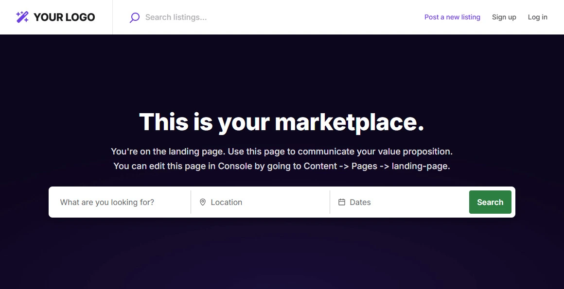
This is usually the very first task on a Sharetribe design checklist, and for good reason: it’s reversible, it’s instant, and it touches every page at once. Upload a real logo, pick a color scheme that matches your brand guidelines, and the marketplace already looks less like a demo before you’ve written a single line of custom CSS.
Homepage content and structure
The Console’s content editor lets operators rearrange homepage sections, swap hero images, rewrite headlines, and add or hide blocks – hero banners, featured listings, category grids – without a developer. This is where most of a marketplace’s personality gets built in the first weeks after launch.
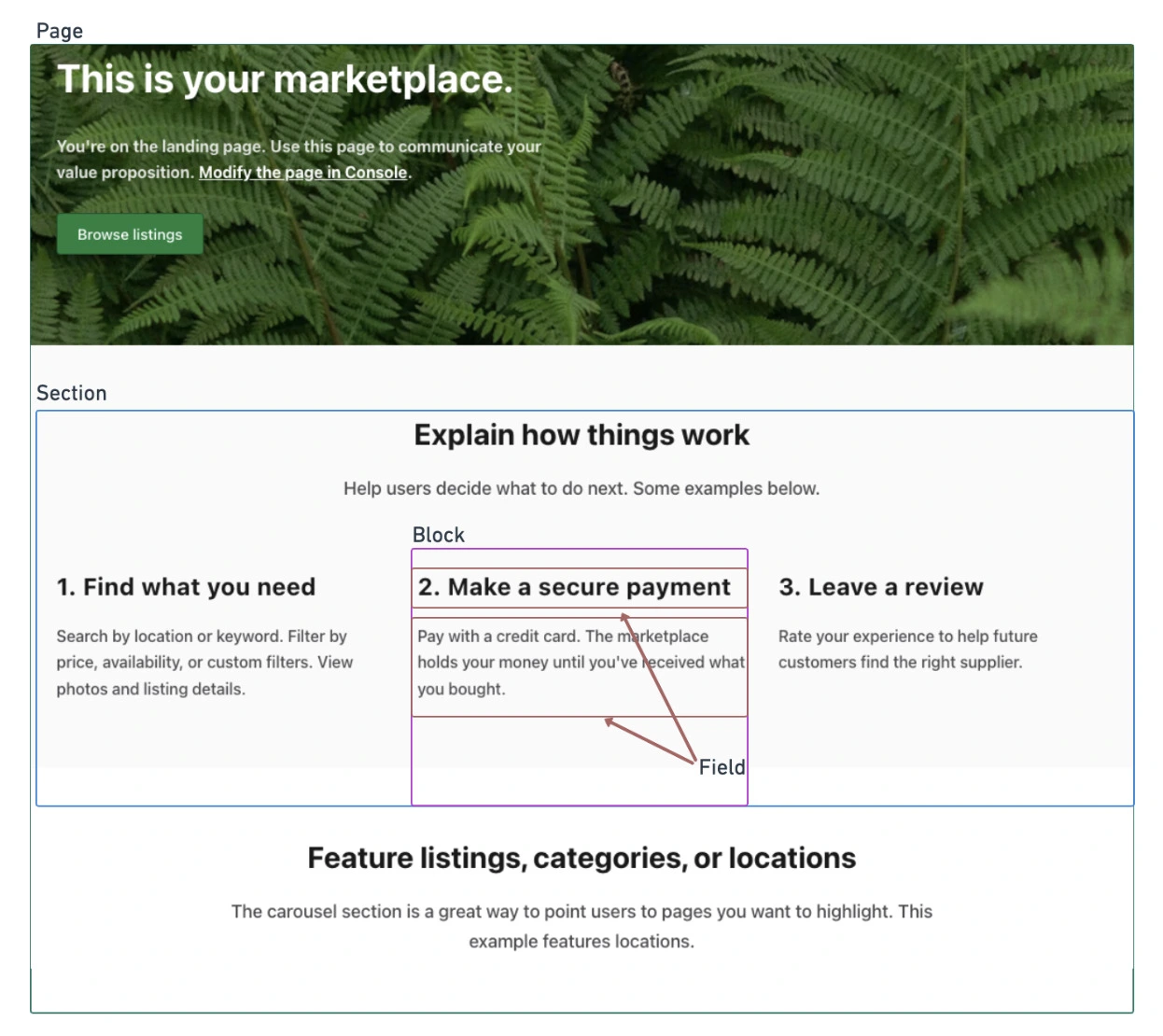
Copy matters as much as color here. Sharetribe templates ship with placeholder text written for a generic marketplace, not yours; swapping it for language that speaks directly to your niche’s buyers and sellers is free, no-code visual customization that most teams underuse. If you want to know more about going beyond the basic setup, check out our detailed guide on how to customize a Sharetribe marketplace.
Figma mockups and development: the layer above no-code
For anything the Console doesn’t expose – custom listing card layouts, bespoke icons, non-default fonts, unique component styling – the work moves into design and development. A designer creates a Figma mockup showing exactly how the page or component should look, and a developer then writes the code and styles needed to match it inside the Sharetribe template. There’s no file you can upload anywhere to change a font, an icon set, or a layout on its own – every visual change beyond the Console’s no-code settings has to be built into the code by a developer.
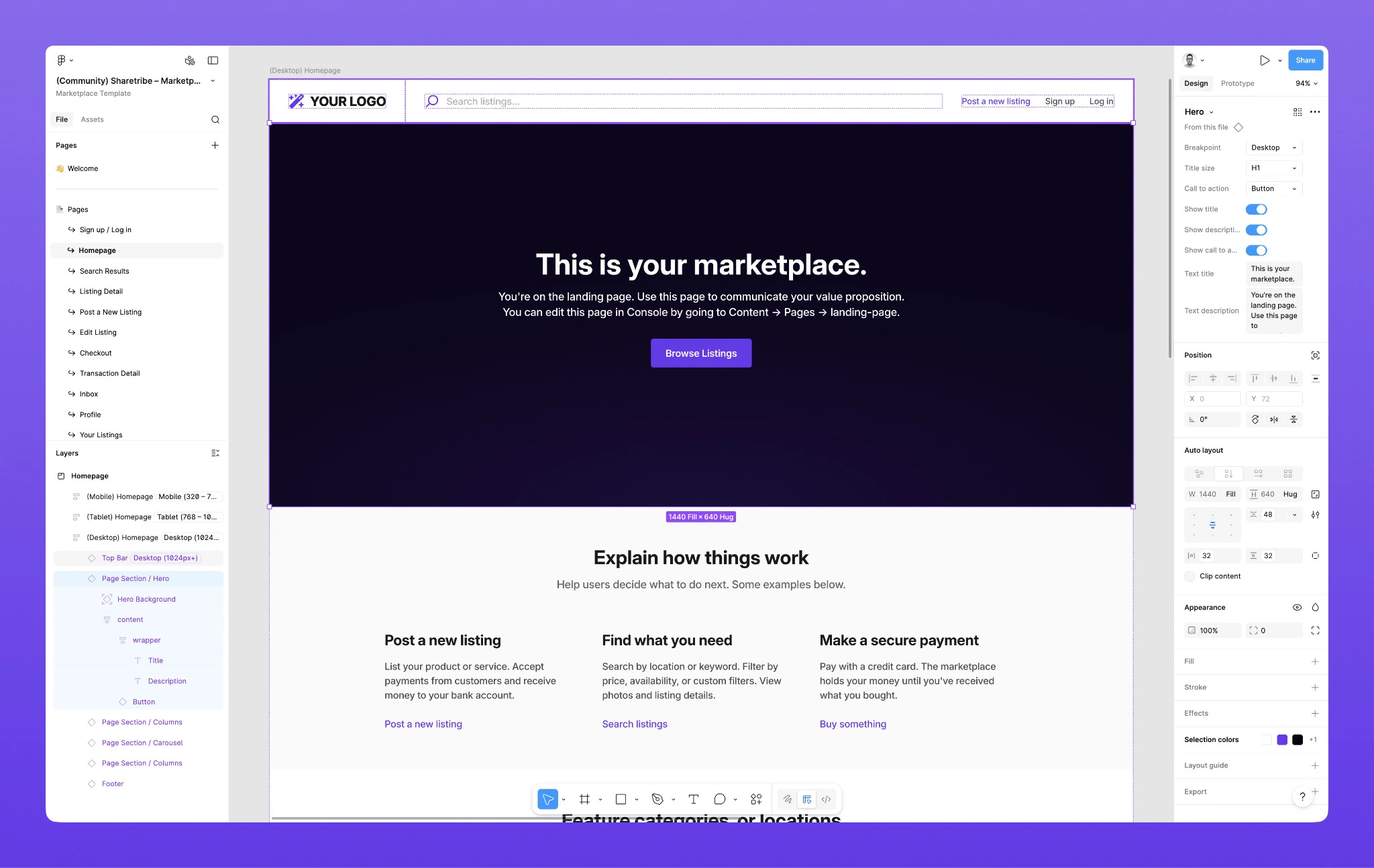
This is also why undoing a custom visual change works differently than undoing a Console change. Flipping a setting in the Console takes effect everywhere immediately, since it’s built into the platform itself. Removing custom styling that a developer built from a Figma mockup means the developer has to take that code back out – it’s a normal, usually small, piece of dev work, not something that reverts on its own.
Element | No-code visual customization | Needs a Figma mockup + developer |
|---|---|---|
Logo, favicon, color scheme | Yes – Console > Branding | – |
Homepage sections & order | Yes – Console > Content | Advanced layouts may need custom sections |
Listing layout & image aspect ratio | Yes – Console > Listings (map or grid view, image aspect ratio) | – |
Fonts | Limited preset choices | Custom web fonts need a Figma mockup + developer |
Listing card layout | – | Yes, Figma mockup + developer |
Custom icons & illustrations | – | Yes, Figma mockup + developer |
Micro-interactions, animations | – | Yes, front-end code |
When do you need a Sharetribe marketplace designer?
You need a Sharetribe marketplace designer once your ambitions outgrow what Console settings and off-the-shelf Sharetribe templates can express – typically when you want a layout, interaction, or visual system that no other Sharetribe marketplace has.
A few concrete signals it’s time to hire a Sharetribe designer instead of pushing further inside the Console:
- Your listing cards or search results page need a structure the template doesn’t offer – extra badges, custom filters, a map-first layout.
- You want a full brand system (typography scale, icon set, illustration style) applied consistently, not just a swapped color scheme.
- Onboarding, checkout, or messaging flows need UX rework because real users are dropping off, not just a cosmetic refresh.
- You’re rebranding after an MVP validated the idea and now need a marketplace website design that matches a funding round or a real go-to-market push.
In practice, this is never a design-only job. A Figma mockup still needs a developer to implement and maintain it correctly inside Sharetribe’s architecture, which is why most teams hire Sharetribe designer talent and a developer as a pair, or work with one Sharetribe agency for marketplace development that covers both.
Should you hire marketplace designer talent or a generalist?
A generalist product designer can make a Sharetribe marketplace look polished. What they often can’t do on their own is anticipate what the platform’s template structure will and won’t let a developer build later, so a mockup gets approved, then partially rebuilt during implementation.
Founders that hire marketplace designer talent with specific Sharetribe experience tend to skip that rework cycle entirely, because the designs are already scoped to what’s technically realistic.
If you decide to hire Sharetribe designer talent directly rather than through an agency, ask to see live marketplaces they’ve worked on, not just static mockups. A live site shows how the design actually behaves once it’s wired into Sharetribe’s listing, search, and checkout flows – details a Figma file can’t reveal.
Sharetribe design case studies: from template to branded product
Theory is useful. Real examples are better. Here are five actual Sharetribe design and development projects delivered by Roobykon Software, each showing a different path from template to branded product.
Case study 1: Wilder Places – branding without a starting design
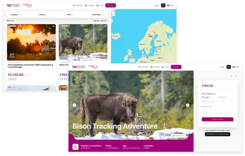
Wilder Places is a nature-based tourism marketplace that connects eco-conscious travelers with nature-based stays, daytime experiences, and multi-day tours across Europe’s most breathtaking rewilding landscapes.
The challenge? There was no design from the start. The founders had a powerful mission and a clear vision, but no visual identity to work from.
The Solution
Roobykon built Wilder Places using the Sharetribe Web Template as a foundation, combined with a modern frontend stack including React.js, Redux, React Router, and Final Form, while Node.js and Express.js handled custom server-side logic. This headless approach – leveraging Sharetribe’s Core API for backend operations – allowed the team to focus on creating a unique, mission-driven interface without reinventing core marketplace functionality.
The Design Approach
The client put together their own design direction rather than commissioning a full visual identity, so we took a pragmatic approach: we styled the project directly through Sharetribe Console – which meant we could customize the color scheme and logo, and adjust branding elements without writing a single line of code. Then we added a custom font to give the marketplace its own personality. Nothing fancy, just enough to move away from that default Sharetribe design and toward something that felt unique.
The Result
React and Redux made it possible to build dynamic content filters by country, category, and budget — exactly what eco-travelers need when planning a nature getaway. And because we’d separated the frontend from the backend, we could tweak the marketplace design and user experience without worrying about breaking bookings or payments.
Case study 2: The Playpen Chicago – skipping traditional design to save time
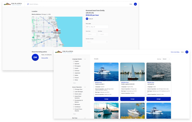
The Playpen Chicago is a P2P boat rental marketplace that connects private boat owners, yacht rental agencies, and independent licensed captains with people looking to rent a boat in Chicago. The core challenge was building a complex booking system involving availability, dynamic pricing, and captain assignments.
The design approach
Instead of investing time and money in custom design upfront, we made a pragmatic call with the client: skip traditional design entirely. We agreed on a color palette, stuck with the default look of the Sharetribe template, and focused every ounce of development effort on the functionality that would actually differentiate the marketplace. Whenever new pages were needed, our project manager would create rough mockups, the client would approve them on the spot, and the team would jump straight into development without any delays.
The solution
Roobykon built The Playpen Chicago on the Sharetribe Web Template, leveraging the Core API for backend marketplace operations. The frontend stack combined React.js, Redux, React Router, Express, and Node.js, with Final Form handling reliable form submissions. By relying on Sharetribe’s core infrastructure for transactions and user management, the team avoided redundant work, while React.js and Redux delivered an intuitive, real-time booking interface.
The result
The platform launched with a clean frontend, robust API backend, and a seamless booking system connecting boat owners, captains, and renters across Chicago. The client was so keen to publish the project that any issues were resolved very quickly.
Case study 3: THIRE – retaining default design architecture for speed
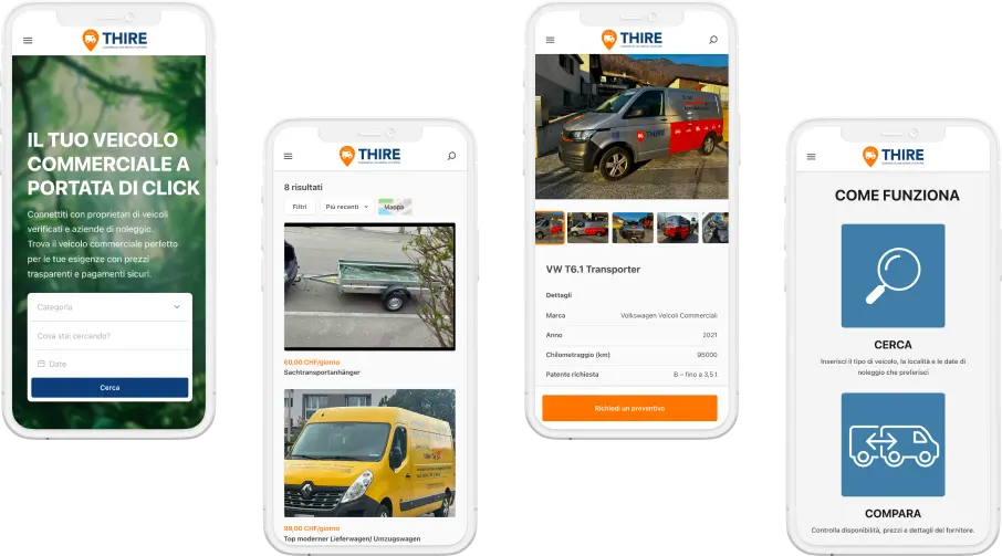
THIRE is a B2B rental marketplace for commercial vehicles in Switzerland. The platform serves everyone from “one-man-band” contractors to massive logistics firms, allowing commercial vehicle owners to unlock new revenue streams while giving renters fleet flexibility without ownership overhead.
The design approach
Given Switzerland’s linguistic diversity (Italian, German, French, English) and the complexity of the logistics market, Roobykon agreed with the client to keep Sharetribe’s default design architecture to save time and maintain reliability. We stepped in to prepare targeted mockups for specific custom tasks rather than undertaking a full redesign.
The solution
Roobykon built the platform on the Sharetribe Web Template, extending its capabilities for the Swiss logistics market. The frontend used React.js and Redux for a fluid booking experience, while Node.js with Express created custom middleware for dynamic pricing and real-time availability across multiple vehicle owners. We kept the clean Sharetribe website design while adding the heavy lifting that made THIRE genuinely useful for logistics companies.
The result
The platform launched with multi-language support (Italian, German, French, English) and a seamless booking experience. Every label and notification adapted to the user’s preferred language. The Sharetribe templates provided a solid foundation, but the custom features made THIRE feel like a purpose-built logistics tool rather than a generic rental marketplace.
Case Study 4: FromLocals – designing for growth from day one
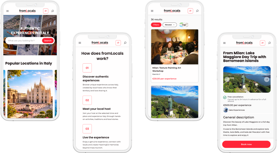
FromLocals is a local experience marketplace founded to connect travelers with authentic local experiences in Lake Como. The challenge was building a marketplace that works perfectly for a small local community now but can scale smoothly to new cities and countries later.
The design approach
The starting point wasn’t features, but a feeling, authentic connection. We worked closely with the founder to figure out what authenticity looks like on a screen and how to build a platform that feels personal, not like a simple store. The default Sharetribe website design is clean and functional, but it doesn’t convey the warmth of local experiences. So we approached Sharetribe design as an ongoing conversation about what makes a marketplace feel human.
The solution
Roobykon leveraged Sharetribe’s core to rapidly deliver a production-ready solution. This strategic foundation provided an immediate, scalable marketplace structure, allowing the team to concentrate fully on customizing the user experience and refining the interface to capture the authentic, local spirit of the Lake Como region. Stripe was integrated for seamless, secure transactions.
The result
The platform launched with features that make it truly local and user-friendly: contextual Google Auto-Translate (English and Italian), smart auto-cancel for group tours, configurable booking cut-off times, and flexible booking confirmation modes. The marketplace design feels warm, personal, and distinctly local — but the architecture is ready for expansion.
Key takeaway: The best marketplace design is the one that grows with you. FromLocals started with a sharp focus on Lake Como but was built with expansion in mind from day one. That’s the power of choosing the right foundation and customizing it strategically.
Do you need a full redesign for every Sharetribe customization?
No. A Figma mockup and a developer are only needed for changes the Console doesn’t expose – custom listing card layouts, non-default fonts, bespoke icons, or component-level styling. Logo, color scheme, homepage content, listing layout, and image aspect ratio are all handled without them. Depending on budget, focused changes – a custom font, one redesigned page, some targeted styling – often make more sense than a full redesign, since it leaves more budget for the custom functionality that actually differentiates the marketplace.
This split is worth planning around from day one, especially on a budget. Front-load the no-code work – it costs nothing but time – and reserve the design-and-developer budget for the handful of elements that genuinely need it, instead of paying custom-development rates for a homepage headline change.
A useful rule of thumb: if the change is something you’d expect to find in a settings panel – a color, a headline, an image – try the Console first. If it’s something you’d expect a designer to hand off as a Figma mockup – a new card layout, a custom icon set, an animated interaction – plan for a mockup and a developer from the start, rather than discovering the limitation halfway through a project.
Need help figuring out what design approach fits your marketplace best?
Roobykon's Sharetribe experts have guided over 50 marketplace founders through this exact decision. We'll help you determine whether to start with Console, invest in custom design files, or skip design entirely to focus on functionality.
Book a Free Design Consultation
Recommended articles
 How to Understand That the Development Team Is Doing Something Wrong
Development problems rarely announce themselves loudly – they accumulate quietly until something breaks. Based on real project experience, this guide covers the most reliable warning signs of an underperforming dev team, and a symptom-to-root-cause diagnostic framework.
 From Idea to Launch: How to Build a Two-Sided Marketplace That People Actually Use
Thinking about building a two‑sided marketplace? In 2026, you can launch an MVP without coding in days, but scaling requires custom logic, multi‑vendor payouts, and a robust trust layer. Roobykon's guide breaks down business models, feature priorities, software options, and what it actually costs to go custom.
 Sharetribe Reviews 2026: An Honest Look at the No-Code Marketplace Platform
Building a marketplace in 2026? Stop scrolling – this Sharetribe review is your reality check. We've crunched the numbers, analyzed real customer feedback, and mapped the platform against every marketplace type.
 Must-Have AI Tools for Marketplace Businesses
Stop guessing which AI tools you actually need. Our article gives you a complete breakdown of AI categories for marketplaces, real tool recommendations, and a phased roadmap.